Leslieville Signage Phenomenon
Why, one may ask, do so many quaint little furniture boutiques in Leslieville have the same style of signage?
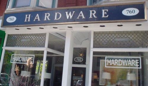
Hardware (or, in the heavy-metal-umlaut version, Härdwäre)
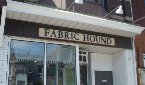
Fabric Hound (by Skeeter Jones, Leslieville business defender)
And then this trio of * & Company stores, owned by Steven Howard-Yandt and Robert Yandt-Howard (yes, Leslieville inverts):
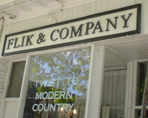
Flik & Company
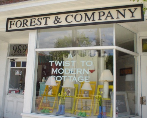
Forest & Company
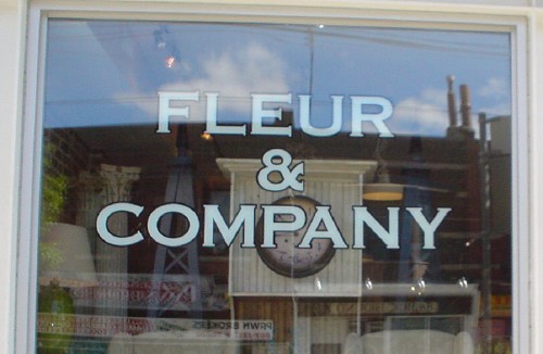
Fleur & Company
Can we have a wee bit more typographic diversity in our twee tchotchke shops, please?
(I recall the now-defunct Saltbox Company, with its equally rectangular sign that was, at least, handlettered. I always felt oppressed that I was somehow expected to know what a “saltbox” was, or need one, or recognize the purpose of business of a store with that name.)