Postmodernism misapplied.
Maddy Harper Lodge
- Where, exactly?
- 86 Jones Ave. north of Queen
- Who owns it?
- Nishnawbe Homes Inc.
- How many units and residents?
- 16 rent-geared-to-incone: 11 one-bedroom, 4 two-bedroom, 1 [three]-bedroom
- Architectural and building history?
- Built 1995
A bit of background first
The Maddy Harper Lodge is indisputably the strangest social-housing complex in South Riverdale. Really, it is. Evidently, based on the use of the word “Lodge,” the signage, and my incidental observations of residents coming and going over the years, it’s a building for aboriginals. All well and good. But it’s a postmodern building for aboriginals. The building houses a group known for their descent through millennia of history in an architectural style that screams late-20th-century. I suppose you could view this as catching the Indians up (possibly a useful strategy for First Nations in general – where are the Indian Internet entrepreneurs? Why are they all the other kind of Indian?), but that would be giving the whole project a bit too much credit.
Instead, the Maddy Harper Lodge sounds like an architect’s long-cherished dream project. He (probably he) waited and waited for just the right commission so he could finally, after long years of lying on the couch dreamily regarding his own cherished drawings, bring his own postmodern masterpiece into the world. Whether or not it actually matches the intended residents... well, why would he be worried about that? It’s social housing. They take what they can get.
And at least it’s an interesting building. I suppose “interesting” isn’t saying much, but on oddball, science-fiction Jones Ave., whose very name seems generic, “interesting” isn’t that bad. I tend to like the colours and the Lodge is at least an effort to show scholarship and connoisseurship.
Postmodern everything!
Right, so postmodern. I swear, the very first time I laid eyes on the Lodge I thought of the classic Spy article “A Guide to Postmodern Everything” (April 1988). I thought about it because Spy told us you could make anything postmodern (a stapler, a tackle box, a Hyundai) by putting a pyramid on top of it. And by gar, that’s what we got at the Lodge. Except the pyramid does double duty as a teepee. Oh, my God, the symbolism.
Anyway, what did Spy tell us were defining features of postmodern architecture? (Excerpted and emphasis added.)
- Does the building have pilasters or pediments or the same colour scheme as the 1984 Summer Olympics?
- Is it a cube with a peaked roof?
- For a building, is it funny?
- Is it funny but not a Las Vegas Hotel or a fast-food stand in Los Angeles?
- Is it easy to like?
I find the Maddy Harper Lodge easy to like.
Yeah. So I admit it.
Critique
(Note to our esteemed readers: Ian didn’t see the above introduction before we spoke.)
Pyramid or teepee? You decide
JOE: OK, so that’s a teepee as far as I’m concerned. Ironic.
IAN: No, uh, it’s a total failure as a symbol of a teepee. And it’s actually a little insulting if it’s meant to be interpreted that way, but it makes for a lovely pyramid-shaped glass sculpture. So I think it would be better to try to forget about teepees when looking at it. Besides which, teepees are round, if I recall. Can we see a picture of the whole front?
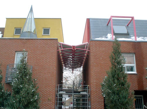
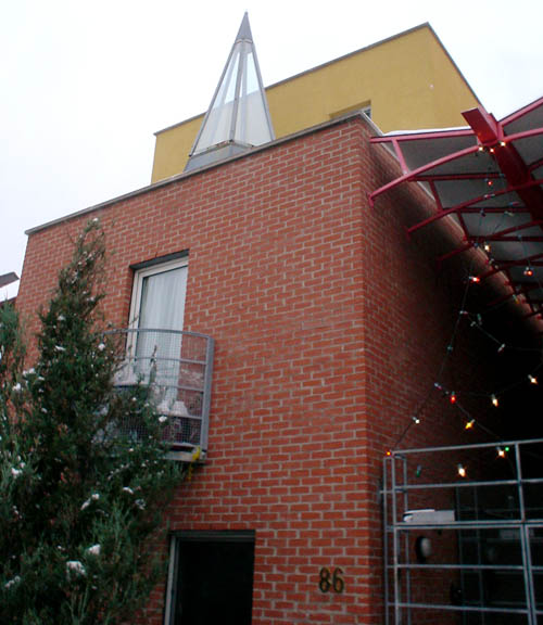
Front view, looking up
JOE: That’s not the whole front.
IAN: Close enough. Can you move this over so I can see it? No, I mean move that so this and this are visible together.
— Not really.
— There. That’s doin’ it. That’s better.
— Well. My turn, I guess. Um, I don’t think the rough steel gate is the right, um, doorway or portal or whatever there. It’s the wrong texture for the massive quantity of brick varieties there. I look at it and I figure it would scrape my hand if I opened it the wrong way.
— Well, I’m not going to argue that. It does look like it would be cold in winter, but, uh, I very much doubt that it’s “dangerous.” I think we need to start with a kind of overview of the building itself and then move to parts.
Three-quarter view
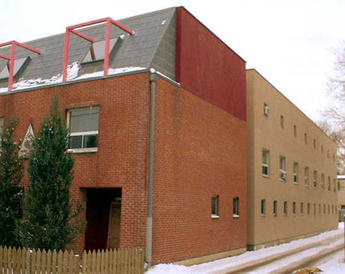
IAN: Ooh. The side is rather disappointing. Anyway, it’s clearly postmodernist. The red steel on the roof is supposed to suggest dormer windows when in fact there are skylights there instead. And we’ve already talked about the teepee. The use of colour, lots of it – oftentimes this type of building can fall into the cartoon category.
JOE: But back when we drove by this, you thought the back end was awful and kind of warehouse-like.
— Well, as you can see from the side, it’s true. It looks like a completely innocuous, well, warehouse.
— But, see, my issue with that is that you were always telling me that postmodern buildings have these regular “punched” windows, usually too small. So isn’t that just a row of punched windows?
— Well, in fact there are two rows of punched windows in the rear section, in the yellow-brick section, one on the main floor and one on the top floor. But all of the effort, whether futile or not, to really make an exciting building at the front gets completely forgotten for the actual substance of the building, because most of the building does not have all of the embellishments or even the same brick colour as the front.
— But I thought that was another hallmark of two different things, and this is the weird case where I know more than you do, because these totally nutbar, um, colour combinations are par for the course in Toronto social housing. It’s how you tell them apart from real buildings for rich people.
— I’m not arguing the signifying colours for Toronto housing or for postmodernism, for that matter. I’m simply saying that the majority of the building has no or little attention paid to it – only the front face, where it’s quite possible they’ve gone overboard.
— And, um, there’s the groove between the front and – the fore and aft wings, as if they knew that’s what they were doing and wanted to make the aft end separable, like the starship Enterprise. The architects would walk off with the front half and show it around and get a few awards and commissions, and we’d leave the poor Indians to freeze in the dark –
— In the back half.
— That’s what it’s saying to me.
— The groove, as you point out, or as you called it, rather, is clearly an architectural device, but it’s meant more for massing and blocking.
— Is there any meaning at all to the really red patch up on the roof?
— Well, “meaning,” I have no idea. Certainly I can’t see that red patch “meaning” very much to a native occupant.
— Well, why don’t we look at the badge?
— Ah. Good idea.
— Or nameplate.
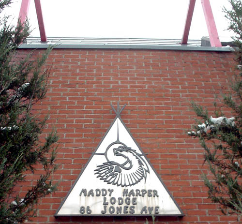
Nameplate
IAN: It appears to be... what is it?
JOE: It’s a teepee and an eagle or something. A bird, anyway. But my thing here is the faux-naïf typography. Sort of Aboriginal Typography Today. They’re using the white man’s language and the white man’s alphabet, but they can’t use real fonts. It’s as if they have distaste for the alphabet. Or they simply deny any scholarship of the alphabet. Their whole culture is about, their whole culture is preliterate so it doesn’t matter what font they use. Why didn’t they just go all the way and do what they really meant to do and use Comic Sans? Or Tekton, if they wanted to be architectural?
— Well, I’m not going to argue too passionately against this, because obviously you know more about fonts than I do. I think it’s important to note that the sign is already bleeding and fading.
— No, I don’t think it is. I think that’s just reflections. No.
— I don’t agree. But we will have to check. Anyway. So here the postmodern architect has an opportunity to take advantage of some iconography – the pyramid, the circle, the eagle-combined-with-a-dragon kind of animal, even some research into Maddy Harper, right? But even though I kind of like this building because it’s fun and exciting, it just doesn’t relate to nativeness.
— It’s at odds with nativeness.
— Yes. Well, for one thing, it’s a solidly-built structure made out of brick.
— Well, but if you grant that because time has marched on –
— Yes, but then I could say the same thing about your little jeremiad about preliterate culture. Time has marched on for the natives as well.
— My thing is that, um, postmodernism is sort of a trick foisted on these people. It’s a really nice and advanced and recherché way of sticking poor people with a building that commits some kind of psychological offence against them.
— Uh, well, if you’re talking about the front of the building, I think you’re completely wrong insomuch as it being an “offence” to natives. Oftentimes postmodern buildings are designed to be humorous, critical, countertextual, and often end up being... what’s the word you used?
— What?
— A psychological offence to everyone. I don’t think your argument is strong enough that this is somehow offensive to natives. A lot of postmodern buildings are just plain offensive. Anyway, can we see the front again? It’s not a true pyramid on the top when you look at it closely.
— No, it isn’t.
— It actually looks like a true pyramid, actually, when you look at it closely. This type of architecture is often designed in a way to endow meaning back into a building. But the fact is that nobody really gets the meaning except the architects and perhaps other architects or critics.
— But hold on. But then you get veddy veddy important people explaining your own building to you if you live there. Um... if we sat around waiting for that you and I wouldn’t be doing this.
— Hm?
— We’re doing our own interpretation. We can’t just wait around for the architect to explain what he was doing.
— Of course not. That’s the whole point. The building, according to this kind of postmodern style, should speak for itself.
— Ah.
— With a “language.” Personally, I’m far more interested in the experiential aspects of buildings. Doesn’t mean I’m not willing to discuss, you know, embellishments and colour and texture. But experientially, this building, at least from the front, looks pretty interesting, pretty unique.
— And they’ve got a courtyard.
— Metal gates aside, I think the central entrance loggia is pretty great. It’s grand. It does a great job of separating the two buildings, and it’s covered with this really fascinating kind of canopy that actually looks a little less postmodern.
— Actually, I was trying to find a way to put that in edgewise.
— I think it would be a nice way to enter into a complex of housing, a housing complex.
— I think that canopy is the ribs of an animal or something. Looks more like fish, which it could certainly still be. And I think that canopy really and truly spans the ages. I think it’s sort of a cruel, hard, technological fossil that actually does refer to living off the land. Or it’s the rack the natives used to use to tan hides. That’s just like a supposition or whatever.
— Or it’s the bottom of a boat or canoe. Or it’s the roof the lodges that they used to build in the – forget the tribe in B.C. You know, exposed rafters and so on. I think it’s, uh, very interesting that you’re talking about the symbolism of something. Because that means the building is working for you. Right? It’s making you think of something other than the experience of the building. I just sort of counter that, although I think that you may be right. There’s a world-renowned architect–engineer, Santiago Calatrava, who uses bones and skeletal structures, researches them, to inform how he can engineer a building. He’s totally not a postmodernist. But the canopy is almost Calatravaesque.
— Hm. I haven’t actually gone into the courtyard because I haven’t gotten an invitation. Oh, and like all these buildings, I asked them who the architect was and so on and didn’t get an answer. I suppose I’ll eventually get around to looking it up.
— You see, I’m just sort of now starting to, uh, get the more sort of symbolic interpretations you were making earlier. I think that, even though the faux-dormer and the glass pyramid are fun and playful, they also sort of make it look like it’s a place for children. It’s kind of condescending. Patronizing.
— Well, that’s what the whole social-housing colour scheme is all about as far as I’m concerned.
— That it’s patronizing?
— No, that your lot in life is so shitty that you need to be cheered up by paint.
— Well, I have to disagree. Much of the time, the colours that you talk about are rendered in brick more often than paint. And brick is a sort of substantial, expensive, respectable medium. I don’t think some of the banding and, you know, texture difference and so on was meant to have the buildings look like, you know, a jolly good time.
— I seem to recall in Etobicoke there was a building with enamel-covered steel. Paul Arthur used to tell me that was the most expensive thing in the world and it would last a thousand years. What do you think of the semicircular Juliet balcony?
— Well, like almost everything else at the front of the building, it’s false.
— Why, because Juliet wasn’t a Mohawk?
— No, it’s a mere embellishment to suggest something else. I don’t believe for one second that that window is a door.
— Oh. I was wondering if it was too short.
— And I can also tell you that that railing, so-called railing, would not pass code, because there’s too much space between each horizontal rail.
— There’s a netting there.
— I don’t see it.
— It’s there. It chicken wire.
— OK. I can see clearly that there is chicken wire and that that’s not a door. Not chicken wire.
— Mesh.
— Mesh, yes.
— What do you make of the trees? Completely symmetrical, by the way, and they’ve chosen trees that naturally grow in a pyramidal fashion.
— I like that they’re evergreens and they’re spiky.
— And the fact that there’s greenery, because there’s not much front yard.
— Yeah, just from walking by there over the years, since it’s right down the road from the library, I’ve seen the ground-floor resident on the right side. It’s a ground-floor apartment. I wonder if it’s an accessible unit.
— You sure it’s an apartment and not a room?
— No, but it looks inhabited. It doesn’t look like a special function room or whatever.
— Oh.
— So anyway I was just thinking that the resident there needs as much cover as she can get. I wouldn’t feel safe, frankly.
— So you’ve been walking by this lodge –
— In quotation marks.
— For how long?
— As long as I’ve lived in Leslieville.
— I’m just trying to pin down the age of the building.
— I seem to think late ’90s. But I don’t know. I can’t even figure out who owns it. But that’s another Herculean task that’s part of this whole nightmare I’ve gotten myself into. It’d be nice to be able to stop thinking like a journalist for a change.
— Well, here’s your chance. You’re thinking like an architect.
— There. That’s it.
— No, I have one more thing to say.
— The Symbionese Liberation Army still has a statement to make.
— It’s not my style. It has problems. But I really respect that an effort was made.
— Especially on that weirdo street with the weird name, Jones. I guess you weren’t going to say that.
— This is by no means like other buildings comma, instantly recognizable, i.e., Soviet Moscow housing blocks. It’s rather the opposite of that. So people can hate it if they want, but it’s made an effort. The architects, anyway.
— Well, I don’t hate it.
— I bet some people do.