55 Pape Ave.
- Where, exactly?
- 55 Pape Ave., south of Queen (quite clearly visible from the western corners of Queen and Pape)
- Who owns it?
- Woodgreen
- How many units and residents?
- 157 units, according to the official site (which lists the building at the rental office’s address, 43 Pape): 37 bachelor (partially furnished) and 65 one-bedroom (all RGI); 3 one-bedroom wheelchair; 36 two-bedroom; 2 two-bedroom wheelchair; 8 three-bedroom
- Architectural and building history?
- Built in 1996

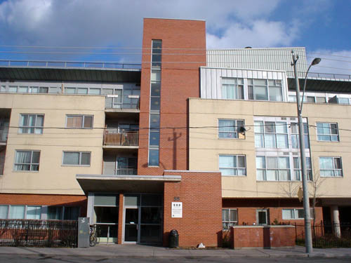
Front view
JOE: This one’s slightly off the beaten path, but it’s just a few paces below Queen, even though that’s enough paces to make it almost “officially invisible.” I really like the articulations around the entrance. I like the fact they’re doing 20 different things there. Mm?
IAN: That’s definitely more of a modernist building than what you like to call postmodern.
— And why is that, Ian?
— Well, I guess aside from the entrance, it’s due to its overall simplicity; there’s nothing really there that’s decorative – just planes of different materials and it’s all very orthogonal. What are those?
— That’s the garden for the lucky ground-floor tenant.
— Oh, that’s interesting. Sometimes these buildings neglect their duty to the street, but this one has a little garden/terrace and a little hedge.
— It has its own mail-distribution box and a fence.
— That’s a hedge.
— It has a line through it. It’s a fence.
— With a hedge in front. Anyway, can we look at it? Well, they have balconies.
— One of which is recessed.
— Well, they both are. This one is rusted. It’s nice; it’s like a layered... I dunno. Would you let me think? It’s like a layered expression of a pretty flat building, so it gives it a lot more depth and presence. Shadow and so on. Without relying on things like silly hats over entrances.
— And my thing is that they’re using the typical Toronto building colours, especially that bullshit “buff brick” we see so much of, but that buff-brick colour isn’t actual brick.
— No, it’s red brick, buff stucco, and the steel – or grey-painted – is really interesting; you don’t see that – in these types of buildings, anyway. And even though it’s more classically modern than some of the other buildings, it’s less intimidating and less sterile. Ahh, “sterile,” I dunno.
— No, that’s brick. It is brick. The buff brick –
— It is brick. Well, that still works.
— It’s as though the centre is a chimney of some kind.
— Tower. It’s a pretty classic move, actually – tower at entrance. The other thing it does to some extent is individualize the suites, right? – with the different-coloured bricks and the steel fourth floor and this vertical tower versus this red banding, so it breaks up the building so you can more easily conceive of these as apartments or homes. It looks like an architect designed it.
— I think that it kind of plays down the typical social-housing colours you get in Toronto. But if you turned around and built this in Arizona or someplace, people would project their own local knowledge of the colours onto it and say it’s “mesa” or Indian or something. Or you’d have to do a different version with more unnatural bitter blues along with the natural brown. But it could work in a really sunny climate, probably because it’s west-facing.
— Well, climate has a great deal to do with colour. You could argue that this building wouldn’t look the same in a southern location. And about the yellow brick: It’s been ubiquitous in Toronto for a century.
— Yeah, that’s the problem. And now you get these commentators like Cruikshank in Old Toronto Houses going on about how it’s now one of the metaphors of Toronto housing, or part of the vocabulary or whatever. And that sounds like making a necessity out of a vice, because we were too poor back in the day to use materials beyond what was available locally.
— Come on, the mansions were made out of yellow brick!
— And it’s over, you know? Globalization ’n’ shit. Get us some new bricks.
— Anyway, it’s not the yellow brick that matters, it’s the contrast with the orange brick. The earthy tone is really effective because it grounds the building, separates out these sort of layers.
— So let’s look at the one right behind it, which doesn’t get the afternoon sun the same way.
17 Renwick Cr.

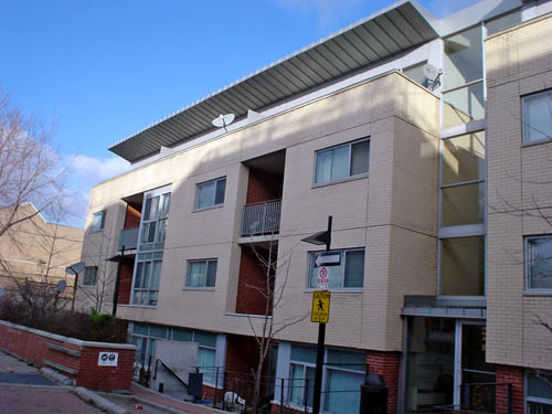
Facing north
IAN: The first thing I said was “That’s a different building?” And then I said that’s a very nice building.
JOE: Yeah, it’s right behind it. It’s got the awning thing going on, which I’m not sure I like, but I kind of do. And it’s way shorter, but it’s much wider. That’s the full extent of the building. Oh, and it’s also built into a slope. The entrance picture – you can’t really tell because that’s at grade.
— It’s made from the same kit of parts that the last building was – the red/orange brick, the yellow brick, the steel accents around entrances and roof. But it’s more successful than the last building because the last building was sort of superficial layers; these have really significant cut-ins like the balconies. It’s a more three-dimensional building than the last one.
— And the red insets of the balconies, eh?
— Yup. That works well. Essentially, it’s the depth and three-dimensionality of it. But you know, the same steel-and-glass accents. And, I dunno, the awning is not an uncommon... device. I like it because it articulates out of the building and meets the sky. But that’s all it seems to do. It’s not really there for shade, I think.
— Except yes, it is, because those are lucky fourth-floor full-width balconies.

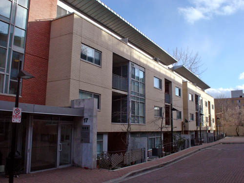
Facing south (from which direction you must enter Renwick Cr. – you drive through a passageway at 55 Pape)
IAN: Yes, but it’s not providing shade in that photograph. Coverage, yes, but not shade. I really like upward-sloping awnings like that. It makes the building look more dynamic, and – but it really is just primarily decoration.
JOE: And they have a glass central tower, really just a really nice elevator shaft, kind of. Why didn’t they project the central tower up above the roofline?
— Because it’s a different kind of building. It’s a much more horizontal kind of building, and everything about the building emphasizes that. The awnings go in long lines, and it’s a lower building. The band of yellow brick is not interrupted as much vertically as it was in the last building. It looks even more livable than the last one, too, which was pretty livable.